
News & events
The life of a logo
16 November, 2021
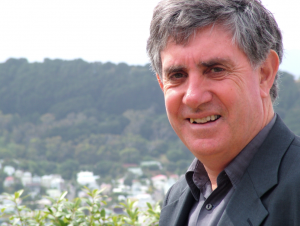
Sir Paul Callaghan
Everything has a life span, even a logo. Ahead of launching our new logo, we take a look at the whakapapa of our current one.
In logo terms, 20 years is a long time. That’s what the designer of the current MacDiarmid logo thinks. Bridget Stocker (now Associate Professor of Biomedical Chemistry at VUW) was doing her PhD in Chemistry at VUW when Sir Paul Callaghan (founding Director of the MacDiarmid Institute) asked her to sketch some ideas for a logo.
“I was a science student, not a professional artist, but I did draw things for people and that was known around the department. Paul knew of TEC’s plans for CoREs, and said – ‘we’re going to need a logo’. Then he asked me if I could come up with some ideas.”
In 2001, Sir Paul had recently moved to VUW and was spearheading the campaign to launch a Centre of Research Excellence (CoRE).
The Institute’s first manager, Margaret Brown, remembers Sir Paul asking Bridget Stocker for some ideas, and says that the design that became the logo was a clear front runner in their eyes.
“We liked the design. We didn’t want a strictly ‘science’ thing – we liked that it was arty and suggested that science would evolve and change over time.”
Richard Blaikie (who was Deputy Director of the Institute when it was founded, and then Director from 2008 to 2011, and is a member of the Institute’s Governance Board) said that the logo was a very personal thing to Sir Paul Callaghan.
It was a real passion of Paul’s to get the name and the logo right.
Emeritus Investigator, Professor Richard Blaikie Former Director and Member of MacDiarmid Institute Governance Board
The Institute is, of course, named after one of New Zealand’s Nobel Prize winners, Professor Alan MacDiarmid. At about the same time as the Government was launching the Centre of Research Excellence (CoRE) initiative, the eminent scientist visited Wellington and Sir Paul Callaghan, as VUW’s Alan MacDiarmid Professor of Physical Sciences, spent time with him.
Original MacDiarmid Institute logo
So how does the original designer feel about her logo having lasted 20 years?
"Twenty years is a chunk of time. I’m glad it’s worked for the Institute for this long. Things shift and the breadth of the Institute has changed too."
Co-Director Justin Hodgkiss agrees, and says the Institute has evolved over the past two decades.
"The make-up and focus of the Institute has moved considerably over this period. We have evolved diversity of knowledge and research areas. Along with chemists and physicists we have biochemists, materials engineers and mātauranga Māori experts. We wanted the new logo to reflect this."
And not only the Institute has changed. Co-Director Nicola Gaston says that over the past twenty years the shift to digital has changed the way logos are used.
“Our logo now sits not only on our website, but on the websites of our contract and engagement partners, and our social media platforms. Plus the logo needs to be read on all kinds of digital devices, from a large screen to an iPhone. So what makes a good logo in 2021 is very different to what made a good logo in 2001.”
With this eye to the future of the Institute, the Co-Directors initiated a logo process earlier this year. Justin Hodgkiss said they wanted the new logo to provide a nod to our current identity and future research while acknowledging and maintaining the history of the Institute.
“Eight researchers volunteered to be on the panel – and we consulted closely at each step with our Stakeholder Relations Partner Iwi Diane Bradshaw.”
The Co-Directors said the process started with the ‘who we are’ from our website –
Tangata whakawhanake - to improve people's lives
We are a network of leading researchers united in a common goal: to create and explore innovative, sustainable materials that will improve the lives of people in Aotearoa and around the world. We work together and partner with industry and government to address global challenges such as clean water, renewable energy and climate change.
The panel then worked with the logo designer, sharing their thoughts about the core values of the Institute, and what our logo needed to communicate and what our logo needed to communicate – our connectedness, our networks, our whakapapa, our science focus, among other ideas.
New MacDiarmid Institute logo
Nicola Gaston said it was wonderful to see so many aspects of the Institute come through in the logo design process.
“We could see the researchers who stepped up for the panel really understood and shared our vision. The designer then worked these concepts into visual beginnings of a logo design, for the panel to consider. We could all see many aspects of the Institute reflected in the new logo – a connected network, joining the dots, partnerships. Atoms as building blocks – a simplified metaphor for materials science. And we’ve purposefully chosen earth-related colours – blues and greens – connecting us to our sustainability research focus.”
The Institute’s Stakeholder Partner Iwi, Diane Bradshaw, from the Ngāti Te Wehi, Ngāti Mahuta hapū of Waikato Tainui, Te Uri o Hau ki Te Rarawa iwi, gifted the te reo ‘Te Mana Tangata Whakawhanake - Leadership to Innovate Sustainable Materials’ into the new logo.
She says in contemporary New Zealand English, the word ‘mana’ refers to a person or organisation of people of great personal prestige and character.
Traditionally, mana tangata refers to the power and status gained through one's leadership talents, strength of character, from basic human rights, or by birth right. Here we acknowledge the mana of our namesake, Professor Alan MacDiarmid.
Diane Bradshaw Stakeholder Partner Iwi The MacDiarmid Institute
“Whakawhanake means to improve people’s lives, to advance, develop, renew, recycle, reuse.
She also said that the logo sets and acknowledges the Institute’s future direction.
“With global demands, our transition to the new logo aligns with the Institute’s enduring aspirations for improved use of resources, acknowledgment of new knowledge, and information systems.”
If we were to say a few words about our original logo – give it a proper poroporoaki - what would they be? We asked some of our investigators and students –
“It’s cool that it was designed by a scientist.”
“That logo links us back to our founder, Sir Paul Callaghan, cause as first Director of the Institute he was directly involved in the logo’s genesis and selection.”
“It’s been the face of the front door of the Institute for twenty years. It’s done the mahi for a long time. That’s no mean feat for a logo.”
So haere rā to our first logo. Thank you for bringing us to where we are today. And a big thank you to all who were involved in bringing it together 20 years ago.
Whakamārama
Ka poroaki tia atu kia tomo mai
ka tika ā muri, ka tika ā mua
Tēnā koutou katoa
(Farewell, moving toward a new logo
Acknowledging our past to prepare for the future.
Greetings to all.)
© MacDiarmid Institute 2025, All rights reserved
Website by WebWeaver Productions